
SCANA ENEGRY
ART DIRECTION
BRAND IDENTITY
CHARACTER DESIGN
MOTION DESIGN
TYPE DESIGN
ART DIRECTION BRAND IDENTITY CHARACTER DESIGN MOTION DESIGN TYPE DESIGN
In Georgia's deregulated gas market, every provider sells the same gas at the same price, leaving almost no room to stand apart. But price was never where SCANA Energy actually won. Customers found the category confusing and hard to trust, yet consistently rated SCANA higher on the one thing that stayed with them after the sale: how well they were taken care of. The strategy was built on that good energy — not the kind metered through a pipe, but the kind felt in how a company shows up for the people it serves.
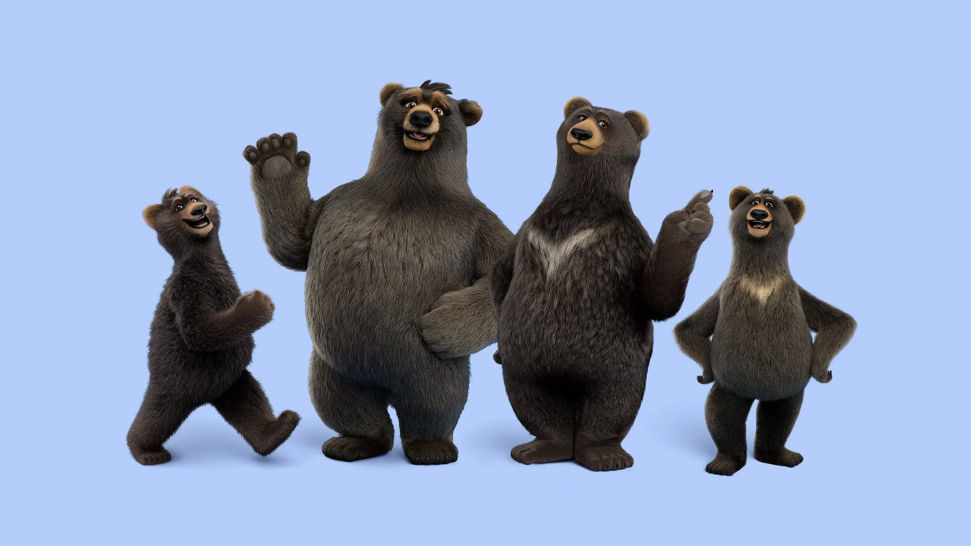
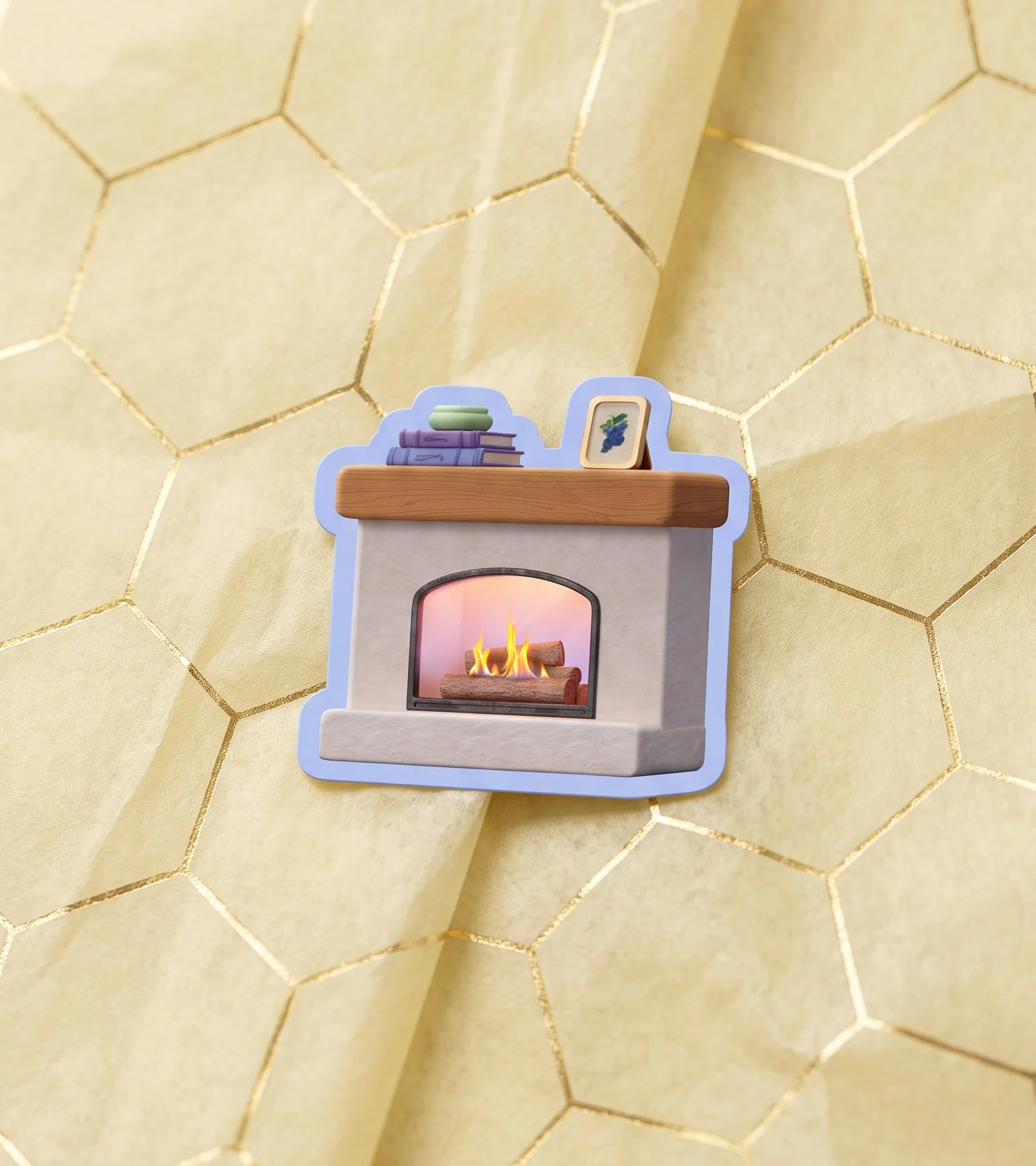
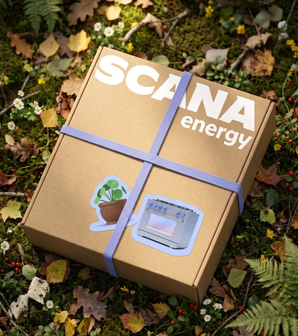
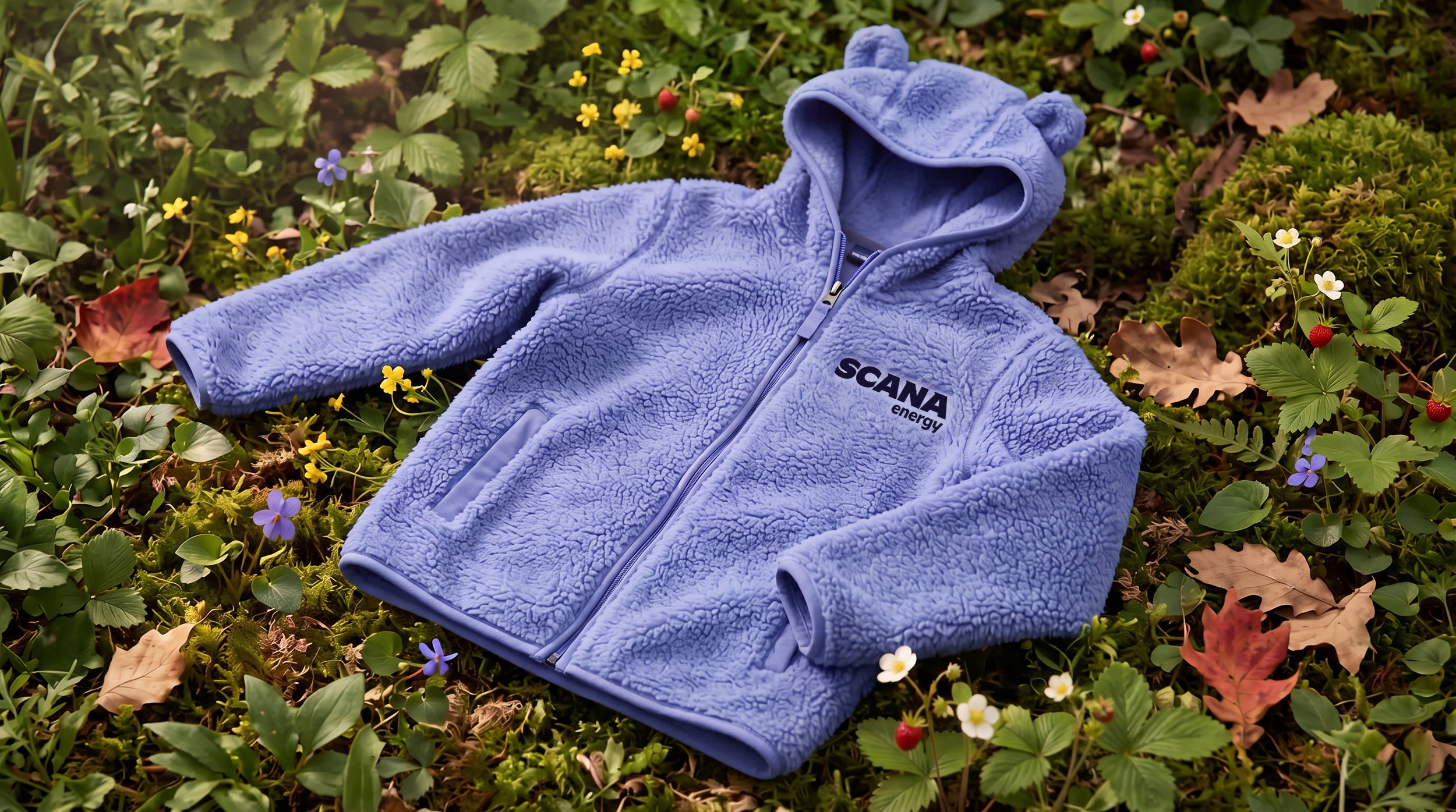
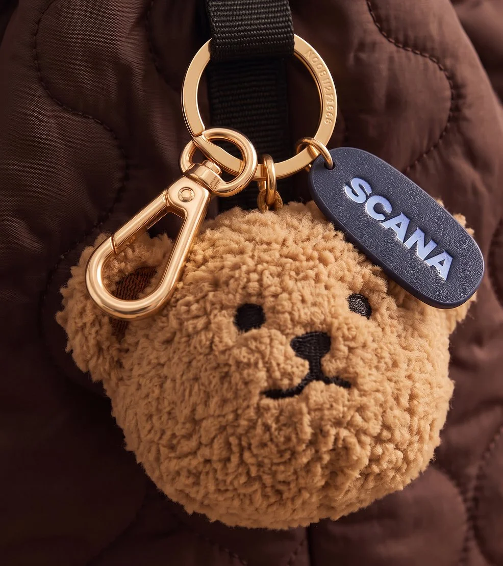
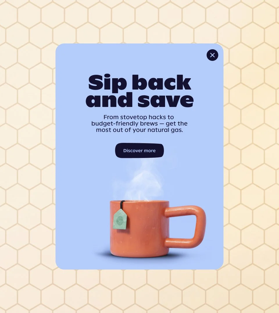
Rather than manufacture a new distinction, the idea was to build around the one thing SCANA already had: Linda, Harry, and their cubs, the bears customers had grown up with and quietly trusted. Instead of retiring them for something sleeker, the identity evolved them into softer, warmer, more expressive versions of themselves, inspired by the same warmth in the people and service behind the brand, and let that added warmth become the spark for everything else. Their instinct for coziness and shelter grew into the organizing principle behind an entire brand world: a custom wordmark and bespoke type family echo their ears, paws, and rounded silhouettes; a flame-warmed evolution of the brand's familiar blues carries the same instinct into color; and a new verbal and motion language lets the bears show up everywhere, from packaging to app to advertising. The result, Big Bear Energy, turns a category built on price into one built on a feeling only SCANA Energy owns.
COMPLETED FOR SCANA ENERGY AT LANDOR NY W/ ERIN WILSON, GIANLUCA CIANCAGLINI, RACHEL HERMAN, VANESSA DING.
CGI + CHARACTER DEISGN BY BUCK.