
ELOUERA
ART DIRECTION
BRAND IDENTITY
DIGITAL & UI
NAMING
PACKAGING
PRINT & PUBLICATION
VERBAL IDENTITY
ART DIRECTION BRAND IDENTITY DIGITAL & UI NAMING PACKAGING PRINT & PUBLICATION VERBAL IDENTITY
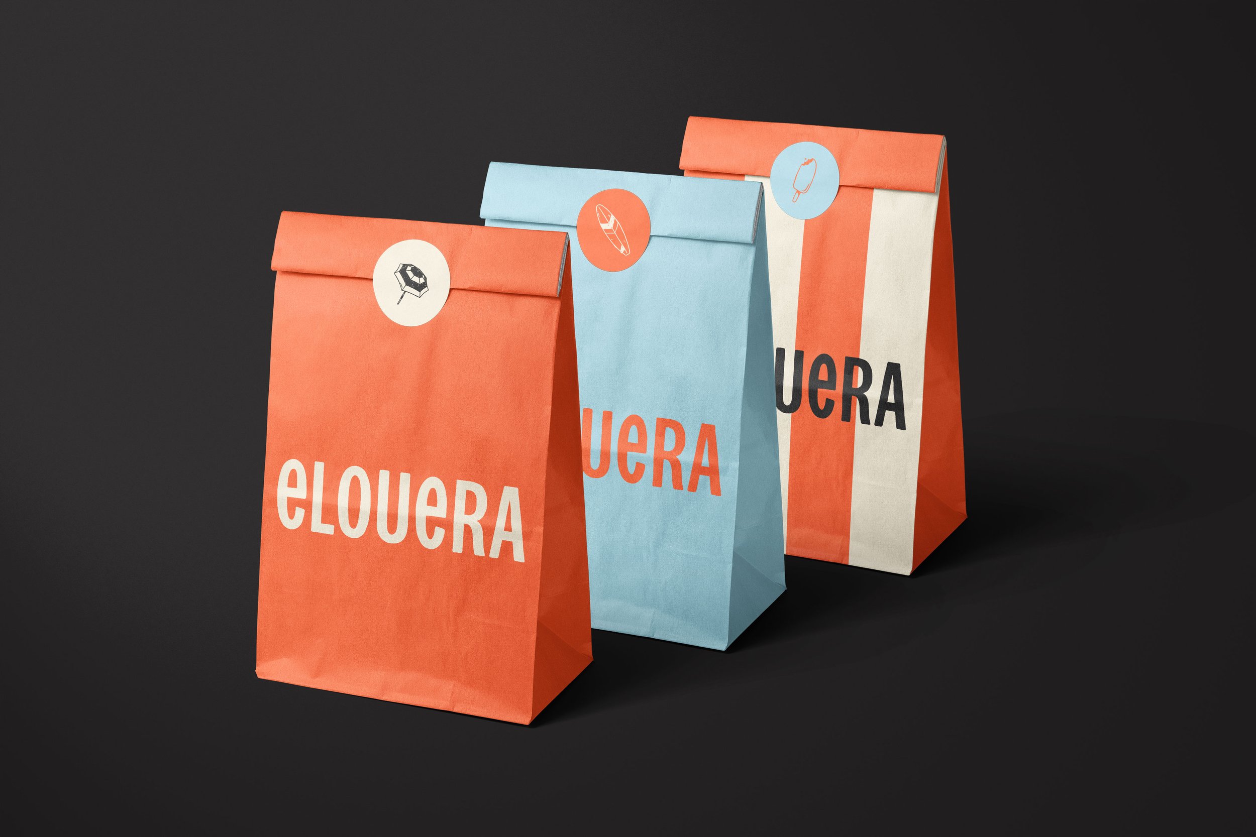
Nestled humbly on the corner of two suburban streets just meters from the beach, Elouera is a local gem with a laidback vibe, great coffee, and those quintessential beach-side eats. The kind of place you stumble on once and return to often. The name, drawn from an Indigenous word meaning “a pleasant place,” set the tone for what the brand would become.
The identity leans into this feeling of easy familiarity. A simplified name, relaxed tone of voice, and unpretentious visual language reflect the café’s grounded charm. Typography and colour choices feel sunny, simple, and local — all in service of creating something that feels as inviting as the place itself.
COMPLETED FOR ELOUERA TAKEAWAY. ILLUSTRATION BY MATTHEW WONG