BARE WITNESS
ART DIRECTION
BRAND IDENTITY
MOTION DESIGN
NAMING
PACKAGING
PRINT & PUBLICATION
SPACIAL DESIGN
VERBAL IDENTITY
ART DIRECTION BRAND IDENTITY MOTION DESIGN NAMING PACKAGING PRINT & PUBLICATION SPACIAL DESIGN VERBAL IDENTITY
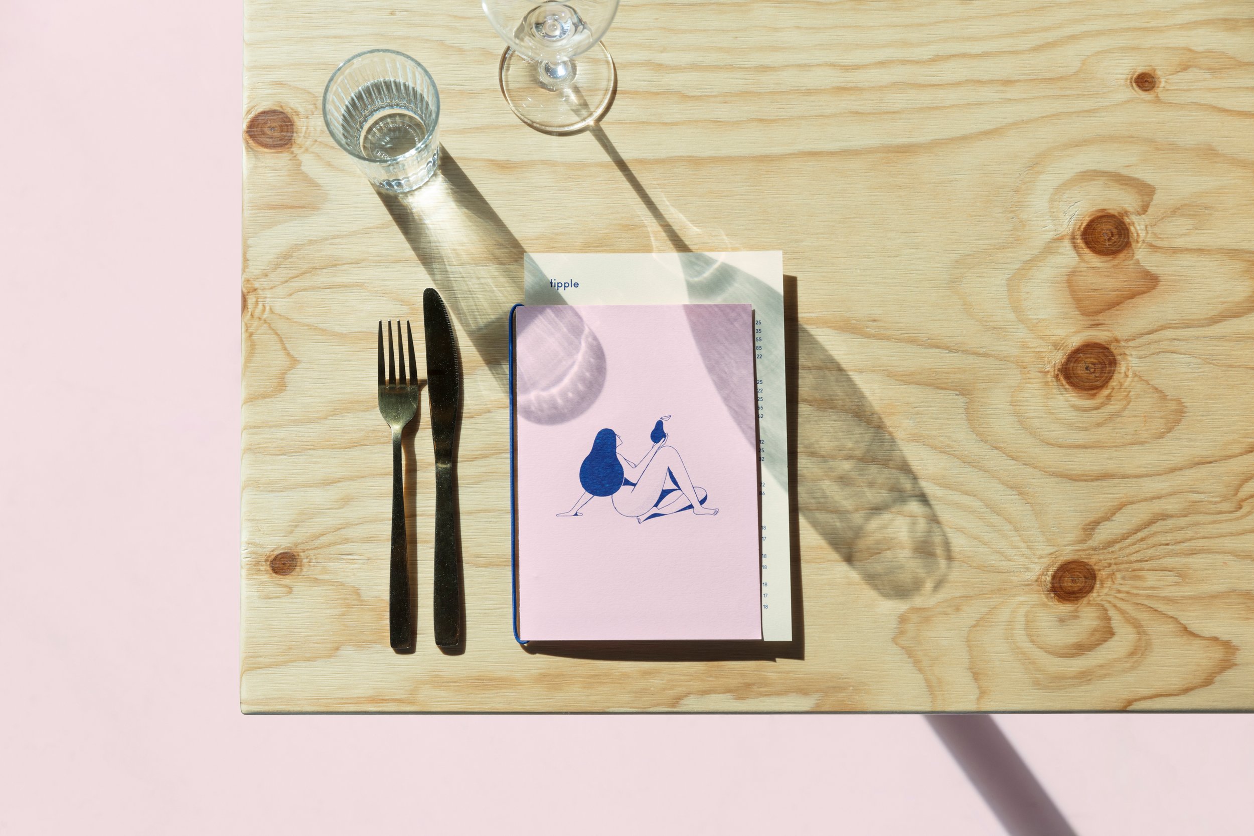
In Sydney’s inner west, the Cho family set out to create a café that stood apart from the city’s ever-growing food scene. They had a clear vision: a place built on honesty, ingredient integrity, and minimal interference. What you see is what you get. We brought that idea to life through identity.
Bare Witness celebrated food in its purest form. The identity featured naked, hand-drawn figures by Christopher DeLorenzo — a playful nod to the name and a reflection of the café’s ethos of leaving things untouched. Their imperfect curves paired with the quiet eccentricity of the Ano typeface to create a brand that felt raw, open, and full of character.
COMPLETED FOR THE CHO FAMILY AT RE SYDNEY W/ COLIN CORNWELL, SUMITA MAHARAJ. ILLUSTRATION BY CHRISTOPHER DELORENZO.
AGDA AWARDS, DISTINCTION, CRAFT: ILLUSTRATION FOR DESIGN. AGDA AWARDS, FINALIST, BRANDING: SMALL BUSINESS. AGDA AWARDS, FINALIST, MOTION: ANIMATION. BEST AWARDS, SILVER PIN, DESIGN CRAFT BEST AWARDS, FINALIST, SMALL BRAND IDENTITY.


